Take Flight
3d Logo Animation
Take Flight
3d Logo Animation
Take Flight
3d Logo Animation
Playhouse asked for a logo animation for Dublin based dance studio Take Flight. The animation should communicate the raw energy and movement Take Flight was known for. The animation should include both the butterfly-like FF logo mark and the complete logotype.
Animation
It became clear very quickly that the most effective way to translate Take Flight’s mission into a logo animation would have to incorporate dance-like movement. To make that happen, I chose the symmetric mark as the main protagonist, being driven by a burst of energy, jumping up and spinning its “head” around quickly, while morphing into the final logotype. Making the idea work meant to morph organically from one to another, which was achieved by using a VDB setup.
Material
Gold as the initial material choice did not communicate the raw energy effectively, it felt too cold and artificial. For the final version we went with a stylized skin-like material, not too literal but still organic enough to feel alive.
Material
Gold as the initial material choice did not communicate the raw energy effectively, it felt too cold and artificial. For the final version we went with a stylized skin-like material, not too literal but still organic enough to feel alive.
Material
Gold as the initial material choice did not communicate the raw energy effectively, it felt too cold and artificial. For the final version we went with a stylized skin-like material, not too literal but still organic enough to feel alive.
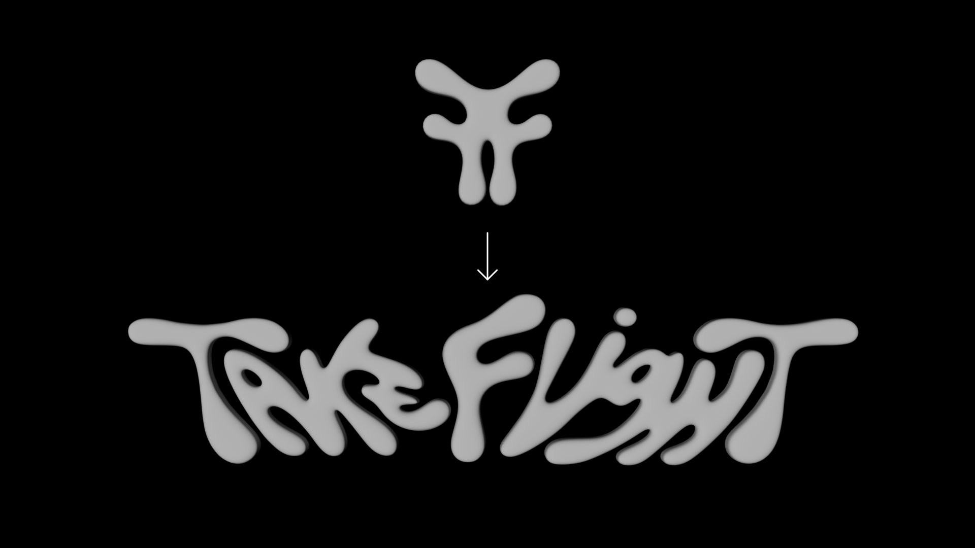
The animation needed to go from the symmetric mark to the full logotype.
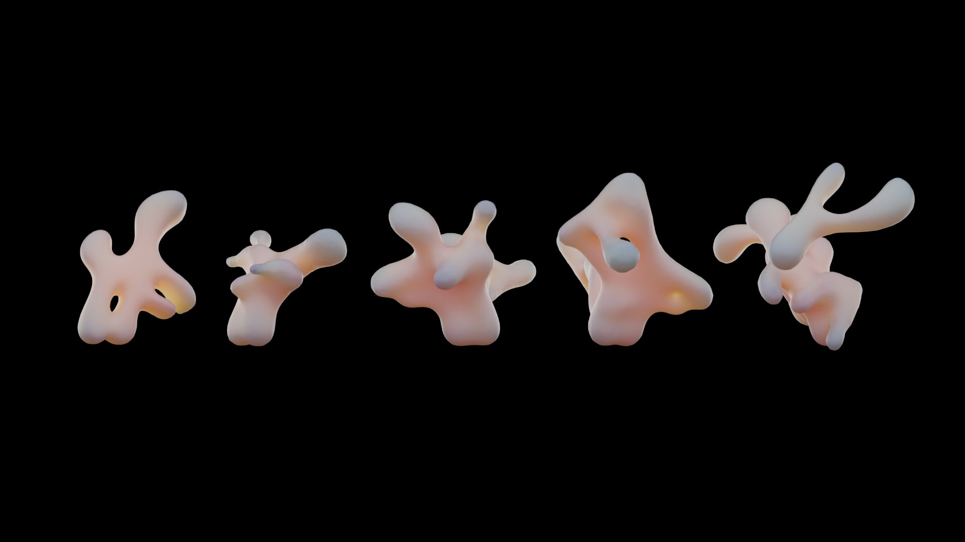
Various degrees of morphing.
The animation needed to go from the symmetric mark to the full logotype.
Various degrees of morphing.
The main protagonist “dancing”.
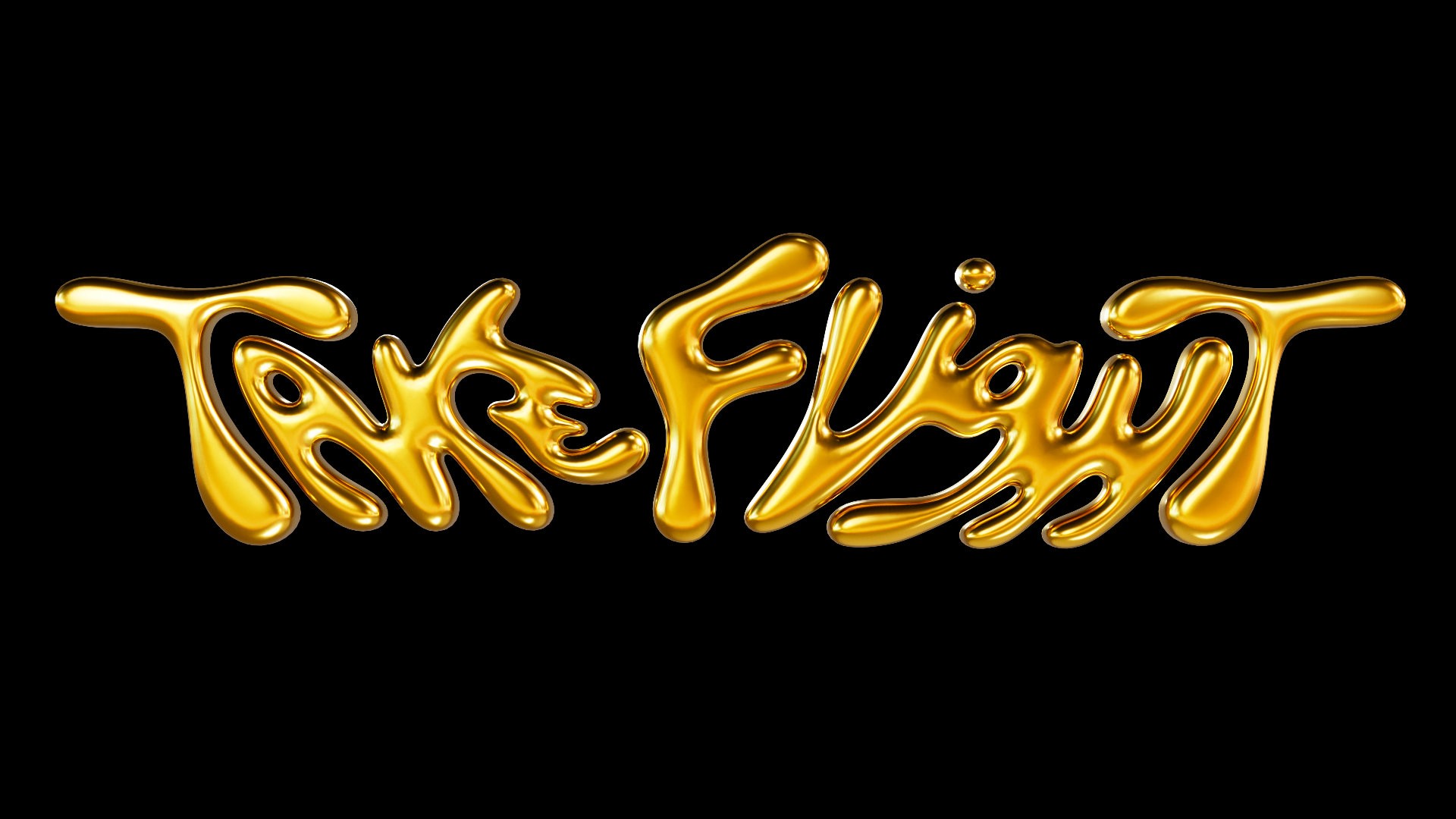
The initial material choice felt too cold and mechanic.
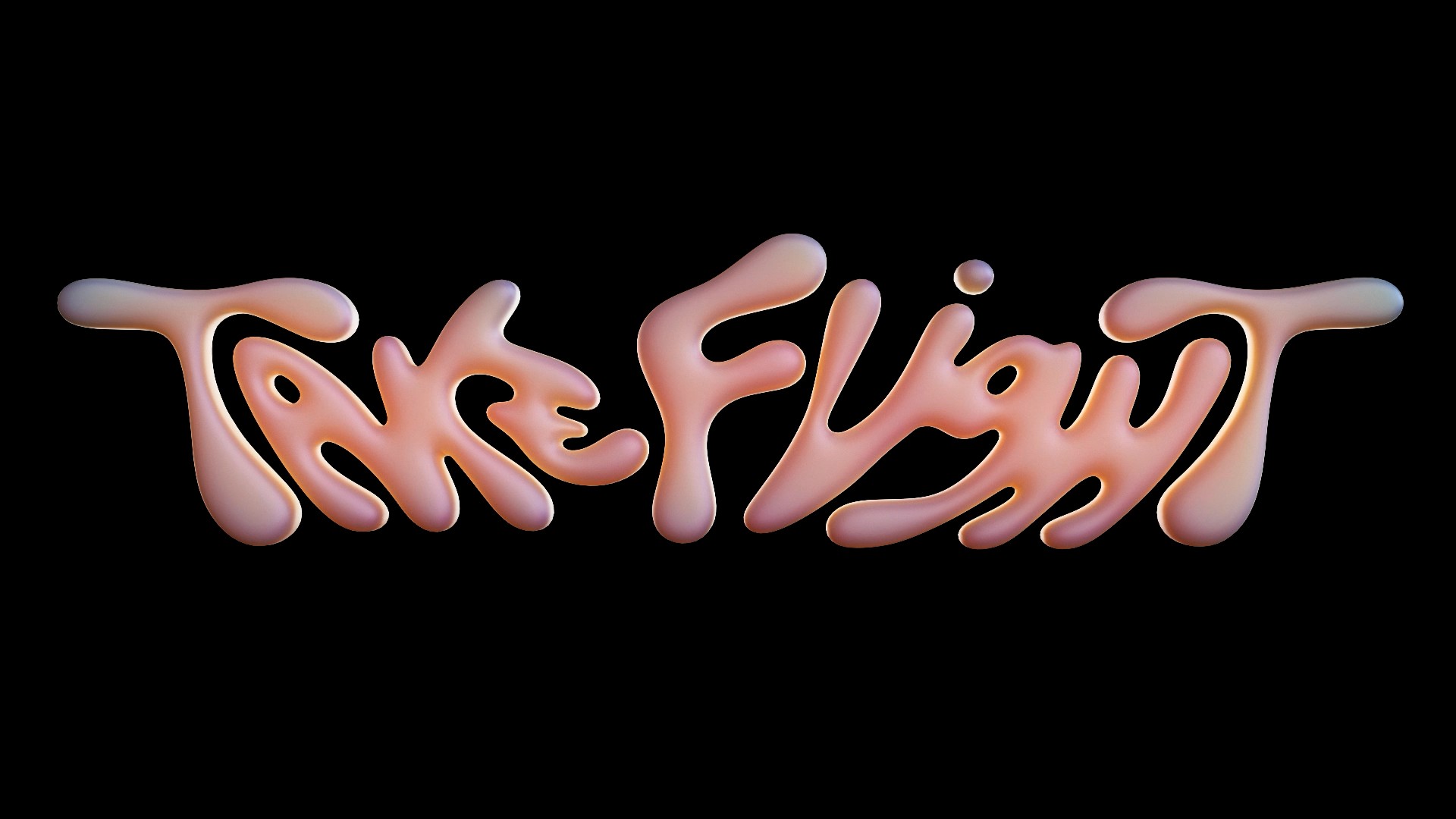
A more organic direction was needed.
The initial material choice felt too cold and mechanic.
A more organic direction was needed.
Client TakeFlight Dublin
Studio Playhouse
Creative Direction Sofia Luna
Art, Animation Direction Vincent Wagner
Client TakeFlight Dublin
Studio Playhouse
Creative Direction Sofia Luna
Art, Animation Direction Vincent Wagner
Client TakeFlight Dublin
Studio Playhouse
Creative Direction Sofia Luna
Art, Animation Direction Vincent Wagner
You’ve been here for
@ 24 fps
Set in Happy Times at the IKOB by Lucas Le Bihan