DIMENSIONAL TYPOGRAPHY & 3D TYPE SYSTEMS
PROJECT
OVERTURE STUDIOS
3D TYPE SLATES
Externe Videoinhalte laden (YouTube/Vimeo) und Datenschutzerklärung akzeptieren. Load external content (YouTube/Vimeo) and accept Data Privacy Statement.
Externe Videoinhalte laden (YouTube/Vimeo) und Datenschutzerklärung akzeptieren. Load external content (YouTube/Vimeo) and accept Data Privacy Statement.
Externe Videoinhalte laden (YouTube/Vimeo) und Datenschutzerklärung akzeptieren. Load external content (YouTube/Vimeo) and accept Data Privacy Statement.
All six idents in full, landscape crop (16:9)
BRIEF + APPROACH
BRIEF + APPROACH
BRIEF + APPROACH
Overture Studios asked for a series of distinct idents, allowing the studio to respond to each project’s mood and energy with an appropriate slate.
I approached this as an exploration of how different visual, material and animation approaches could transport the studio name into six different worlds, while respecting the demand of keeping them colorful and energetic.
Without an overarching brand direction to match, each of the slates was allowed to follow its own internal logic. The overall framework was simple: form, material and animation were not allowed to repeat throughout the series.
FLOATING GEMS
FLOATING GEMS
FLOATING GEMS
IDEA
For Floating Gems I chose a world of levitating rocks and scattered flora, aiming for a calm, slightly otherworldly mood, without drifting into sci-fi aesthetics.
ELEMENTS
The letters were built as two-faced artifacts, using a simple volume builder workflow made of two extruded vectors. The typeface used is a clean contemporary sans, Area Inktrap Extrabold by Blaze Type. I took special care so no overshoots were cut off, using overshooting letters only in combination with other overshooting letters. Rocks and flora assets came from the Quixel library, scattering flora over the main floating rock.
ANIMATION
Quick flashes of light announce the main movement, which sees the individual letters light up and elevate to ease into the final lockup. This main motion was built using two copies of each letter. The first one sticking to the moving rock for as long as the letter was motionless and the second one for when the letter begins to move to the final position, then independently of the floating rock.
Two-faced letters as the core geometry.
The letters were constructed using a VDB setup.
Two sets of letters were needed to allow correct movement. The red set of letters moves with the floating rock, the blue letters move independently.
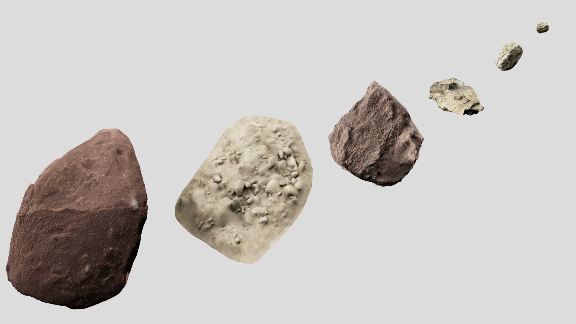
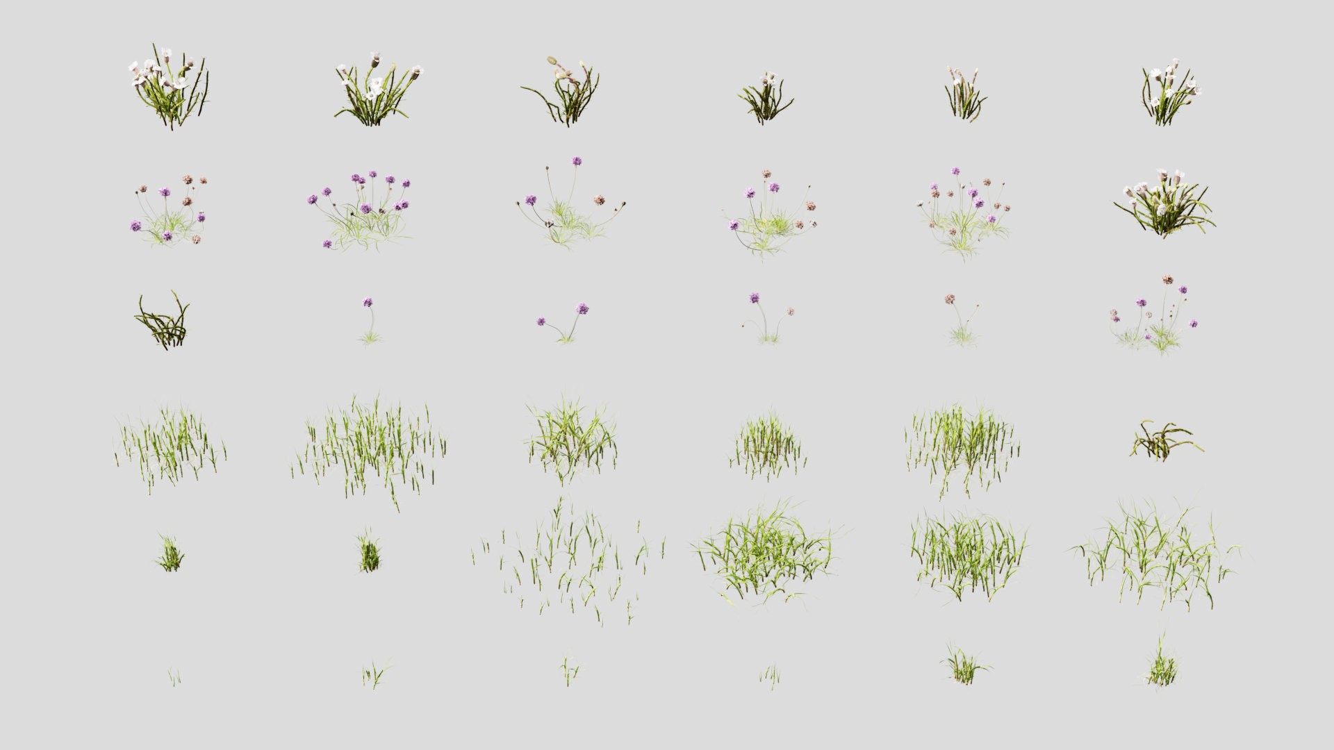
Quixel assets were used to populate the scene.
The final animation.
RETRO GRID
RETRO GRID
RETRO GRID
IDEA
The concept retro grid is a contemporary take on retro graphics, going for a more playful mood including ample lens flare and chromatic abberation.
ELEMENTS
The letters are custom built, based on a regular three-dimensional grid. The whole lettering is made of one continuous line, which is followed by two brightly lit-up tubes and a perforated hull. The background grid helps locate the lettering in space by adding depth and context.
ANIMATION
The mono-line lettering starts building up from a single point on the right side, with each of the illuminated inner tubes forming one word. When they meet on the left, the perforated hull joins in, this time from left to right, completing the studio name and containing the bright lights within it. The camera focusing while pulling out and the lettering rotating slightly add subtle supportive motion.
The lettering follows a dense regular grid.
Two light emitting inner tubes and a perforated hull form the main geometry.
Animation seen from a static camera.
The final animation.
BACKSLANT FAN
BACKSLANT FAN
BACKSLANT FAN
IDEA
Backslant Fan is a concept following a personal formal study and is supposed to walk the fine line between abstract sophistication and playfulness.
ELEMENTS
The letters are based on personal sketches of a backslanted, semi-rounded, grid-based typeface. For the 3D rendition, these letters are built using a tight grid of cylinders, which rotate and scale to reveal the words from an initially abstract shape. The background elements are based on the formal language of the letters, adding a coherent element of depth.
ANIMATION
The letter-building cylinders are initially rotated and scaled-up in length, rendering the words completely illegible. Dancing around for a bit, the fan suddenly rotates around, moving all cylinders to their regular orientation while simultaneously scaling down, to reveal the studio name. The background elements are calmly moving throughout the video, to add subtle additional movement.

Earlier personal sketches (left) inspired the base letter structure.

The letters are made out of a regular grid of cylinders.
Background elements were based on the letter shapes.
Roughly 55.000 cylinders, moving from chaos to order.
The final animation.
CREDITS
CREDITS
CREDITS
CLIENT Overture Studios
CREATIVE DIRECTION Brian Keegan
ART, TYPE, ANIMATION DIRECTION Vincent Wagner
CLIENT Overture Studios
CREATIVE DIRECTION Brian Keegan
ART, TYPE, ANIMATION DIRECTION Vincent Wagner
CLIENT Overture Studios
CREATIVE DIRECTION Brian Keegan
ART, TYPE, ANIMATION DIRECTION Vincent Wagner
BACK TO ALL PROJECTS
BACK TO ALL PROJECTS
BACK TO ALL PROJECTS
You’ve been here for
@ 24 fps